Camillo Sitte in the 21st Century
Exploring a great urbanist's 19th century examples, as they live today
Longtime readers will know how I admire the work of Camillo Sitte, a Viennese architect who identified and documented the elements of continental old urbanism in his 1889 planning classic, The Art of Building Cities. Fortunately, many of the specific locations across Europe that Sitte highlighted 135 years ago are largely intact. For some time I’ve wanted to pair a selection of his original, ink-drawn site plans with present-day imagery.
I now begin this experiment with a few animations I’ve created with Google Earth Studio. Below, each clip shows an exemplary site from Sitte, first in its larger urban context, then zooming in to orbit, close-up, and finally taking the orientation of Sitte’s 1899 ink drawing. I have also provided a link to a Street View of the same site to approximate what a visitor would see. These first three examples are all from Italy. I am hopeful these pairings will illustrate the continuing relevance of Sitte’s work.
When possible, I’ve followed the figure numbering from Sitte’s German first edition, and contextualized the site with language from the 1945 English translation by Charles T. Stewart. A few site plans appeared after the first edition without much explanation: in such cases, I’ve noted where I found them.
Sitte was especially interested in the contrast between how public spaces appeared in plan, and how they were perceived in person. That is, the distinction between a space as seen from above and how it is experienced from a perspective near the ground. In this vein, he taught that irregularity gave character to public space and created an air of mystery that encouraged exploration; that street walls worked together to form spaces that could best be understood as outdoor rooms; and that the placement of outdoor monuments ought to be where they would be most accessible to people, even if such locations (e.g., at the edges of squares) would not strike a surveyor, in plan, as the optimal focal point of an open space.
Ironically, while The Art of Building Cities does include some perspective drawings, many of the sites that Sitte explores in his text are only illustrated in his ink-drawn site plans; so part of the idea with this experiment is to take advantage of 21st-century technology to show these unique spaces visually, in a rich and humane light, complementing that which Sitte described so well.
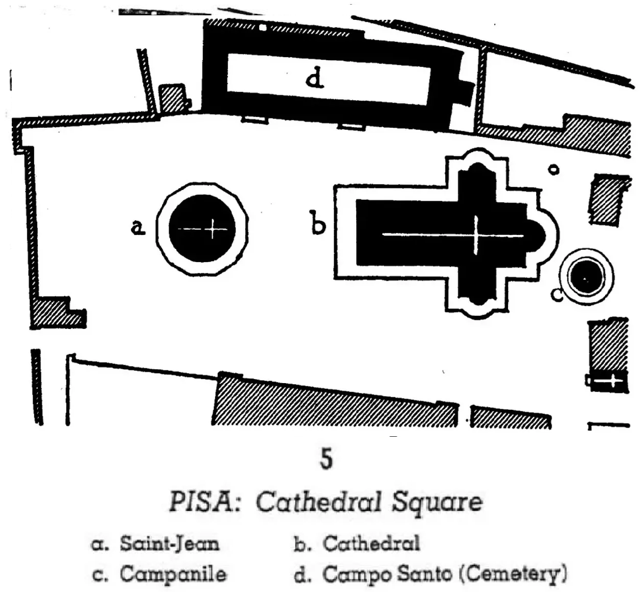
Figure 5 (Stewart translation): Pisa.
“The existence of two powers, temporal and spiritual, required two distinct centers: one, the cathedral square (Figure 5) dominated by the campanile, the baptistry, and the palace of the bishop; the other, the Signoria, or manor place, which is a kind of vestibule to a royal residence. It is enclosed by houses of the country's great and adorned with monuments.”
Camillo Sitte, The Relationship Between Buildings, Monuments, and Public Squares.
Figure 10: Padua.
“The location of the equestrian statue of Gattamelata by Donatello (Figure 10) in front of Saint Anthony of Padua is most instructive. First we may be astonished at its great variance from our rigid modern system, but it is quickly and strikingly seen that the monument in this place produces a majestic effect. Finally we become convinced that removed to the center of the square its effect would be greatly diminished. We cease to wonder at its orientation and other locational advantages once this principle becomes familiar.
“Thus to the ancient rule that prescribes the location of monuments at the edges of public squares may be added the principle followed during the Middle Ages, especially in cities of the north, according to which monuments and fountains were erected at points segregated from traffic. Now and then the two principles are put into practice simultaneously. They avoid common obstacles in seeking masterly artistic effects. Sometimes practical needs coincide with artistic requisites, and this is understandable, for a traffic obstacle may also interfere with a good view. The location of monuments on the axes of monumental buildings or richly adorned portals should be avoided for it conceals worthwhile architecture from the eyes; and, reciprocally, an excessively rich and ornate background is not appropriate for a monument. The ancient Egyptians understood this principle, for as Gattamelata and the little column stand beside the entrance to the Cathedral of Padua, the obelisks and the statues of the Pharaohs are aligned beside the temple doors. There is the entire secret that we refuse to decipher today.”
Camillo Sitte, Open Centers of Public Spaces.
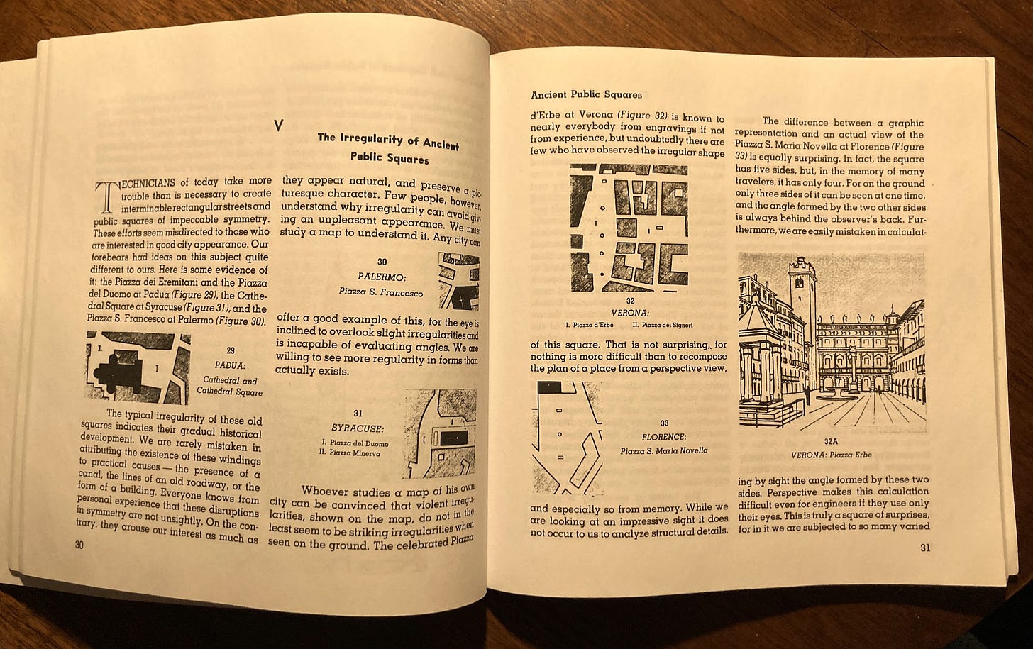
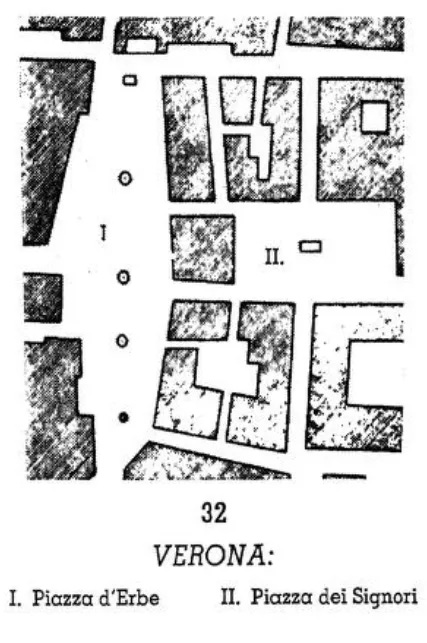
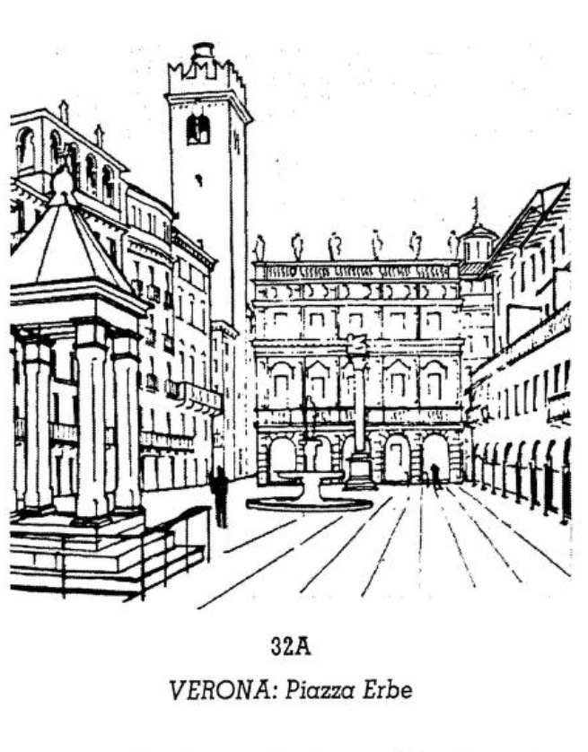
Figure 32: Piazza d’Erbe, Verona.
“Whoever studies a map of his own city can be convinced that violent irregularities, shown on the map, do not in the least seem to be striking irregularities when seen on the ground. The celebrated Piazza d'Erbe at Verona (Figure 32) is known to nearly everybody from engravings if not from experience, but undoubtedly there are few who have observed the irregular shape of this square. That is not surprising, for nothing is more difficult than to recompose the plan of a place from a perspective view, and especially so from memory. While we are looking at an impressive sight it does not occur to us to analyze structural details.”
Camillo Sitte, The Irregularity of Ancient Public Squares


You've got me reading Sitte. So many of his arguments remind me of Jane Jacobs and Jeff Speck -- and even James C. Scott in his Seeing Like a State. I have the sense that his views on irregularities and what makes pleasing public spaces were ahead of his time, but I don't know enough to say so.
Beyond his arguments, Sitte's description of and commentary on specific spaces makes for great reading. I have had my composition students read and write ekphrases, and Sitte would provide great "mentor text" were I to do it again. Some of these passages remind me a bit of the poet Mark Strand's little book on Hopper paintings. Here's Strand's entry for Hopper's "Early Sunday Morning": "We look across the street to a two-story brick building that goes from one end of the canvas to the other. A strip of blue sky stretches above it, stopped on the right side by a square that suggests a tall building. It is early Sunday morning. The shadows cast are long. The street is empty. The powerful horizontal thrust of curb, first- and second-story divider, and rooftop makes us feel that the street and building extend well beyond the building’s purview. How far is not important, because as viewers we locate ourselves at the approximate center of the painting, somewhere between the fire hydrant and the barber pole. We can be pretty sure that if the painting were spread out it would offer only a repetition of the features we are already familiar with. There is no actual or implied progression in the shaded or open windows, none in the doorways and storefronts. Here, as in other Hoppers, the city is idealized. The people are asleep. There is no traffic. A dreamy collaboration of stillness and quiet makes it seem that some magical moment is being extended, and that we are its privileged witnesses."